Tones
Screentones and effect tones.
What a tone is
A tone is the grey of manga: dots, lines and effects laid over an area instead of grey paint. In MangaLoft a tone is not painted on. It is a shape that fills itself with a pattern, so you can move it, resize it and change its settings at any time.
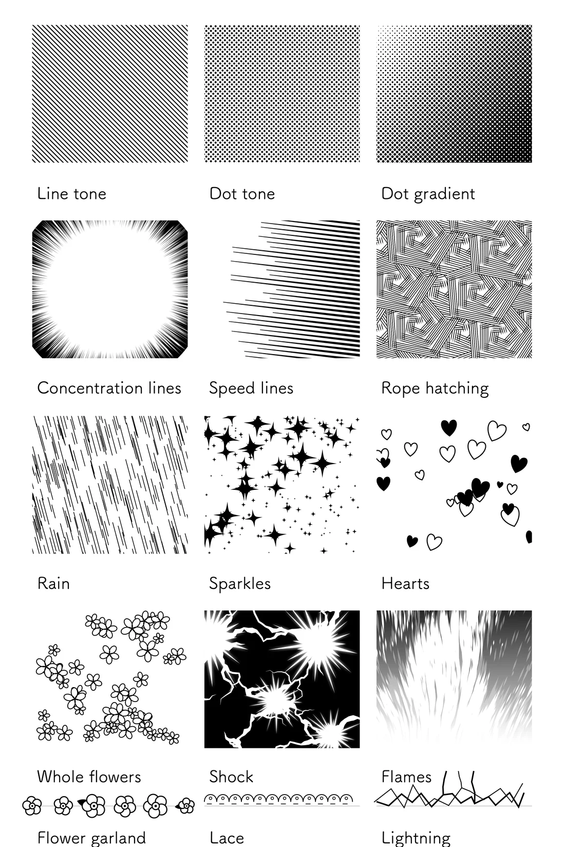
Choose a kind
The tone tool is the square of dots in the strip. Right-click it to choose the kind (on iPad, touch and hold).
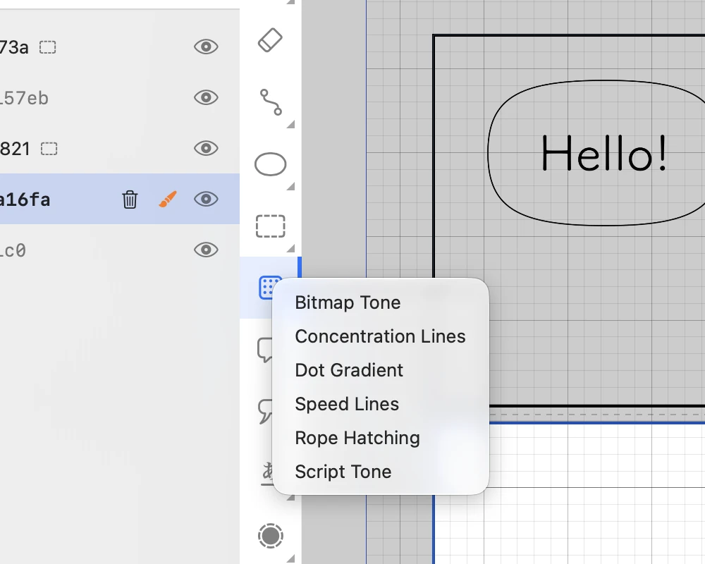
- Bitmap Tone — even dots or lines. The everyday grey.
- Dot Gradient — dots that fade from dark to light.
- Concentration Lines — lines bursting in toward a centre, for shock and focus.
- Speed Lines — lines streaking one way, for movement.
- Rope Hatching — hand-drawn-looking crossed hatching.
- Script Tone — patterns such as rain, sparkles, hearts and flowers.
On iPad, touch and hold the tone tool to choose the kind.
Lay a tone
First choose the panel it belongs to (see Your first page, step 3). Then, with the tone tool, drag across the area.
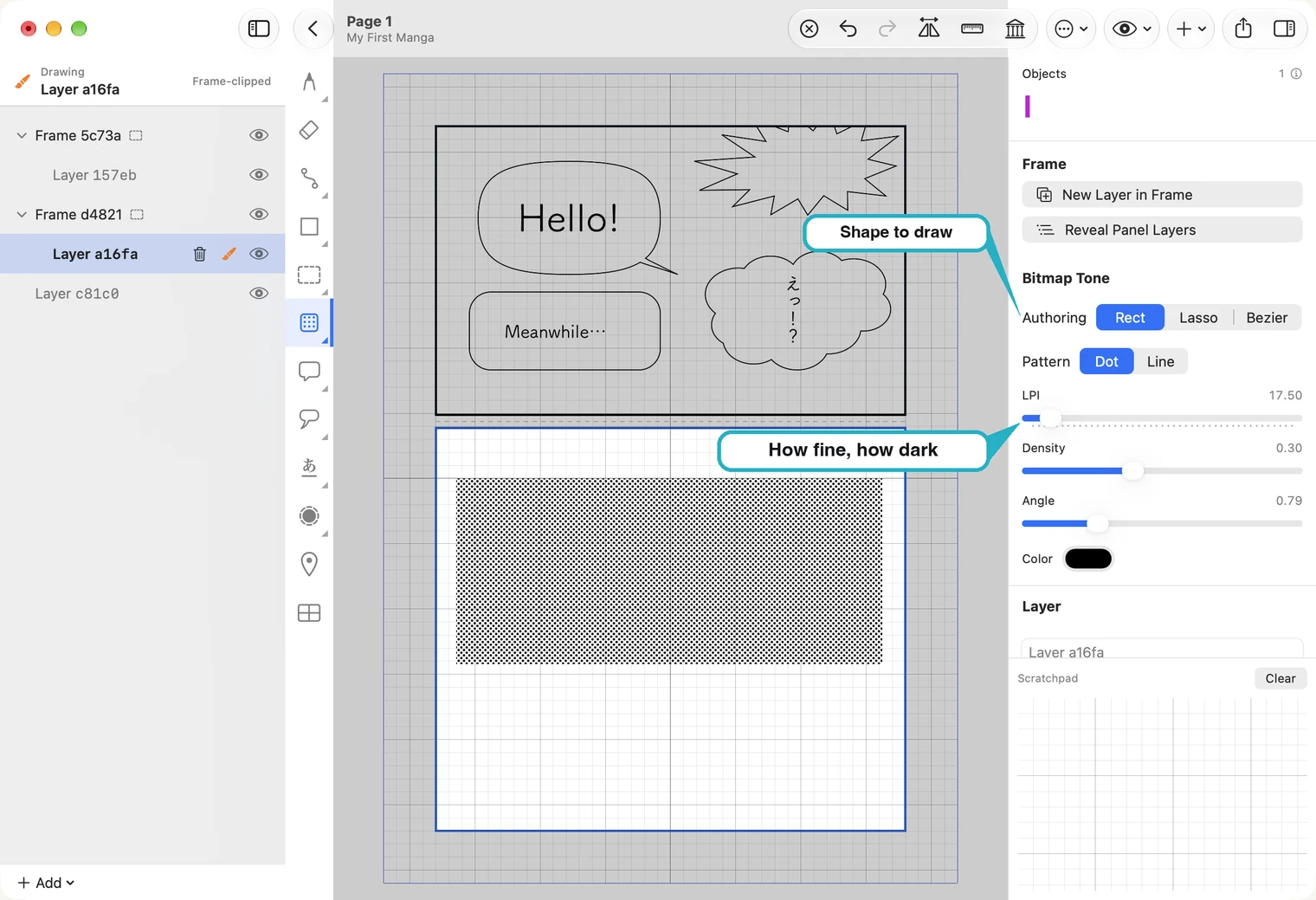
Authoring, on the right, is the shape you draw: Rect is a rectangle by dragging, Lasso a freehand outline, Bezier an outline placed point by point.
For a Bitmap Tone, three sliders set the look:
- LPI (lines per inch) — how fine the dots are. A higher number is finer. The pictures here use a low value so the dots are easy to see; 60 is a common choice for a printed page.
- Density — how dark the tone is.
- Angle — the direction of the rows.
Pattern switches between dots and lines.
Change it afterwards
Nothing is fixed. Choose the selection tool and click the tone: its settings come back on the right, and handles appear around it.
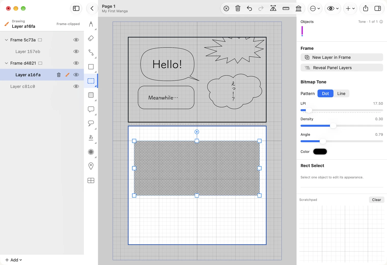
- Drag the tone to move it.
- A corner handle makes it bigger or smaller.
- A side handle stretches it one way. The pattern is not stretched with it: the tone refills at its own density, and a side snaps to the panel border as it nears it.
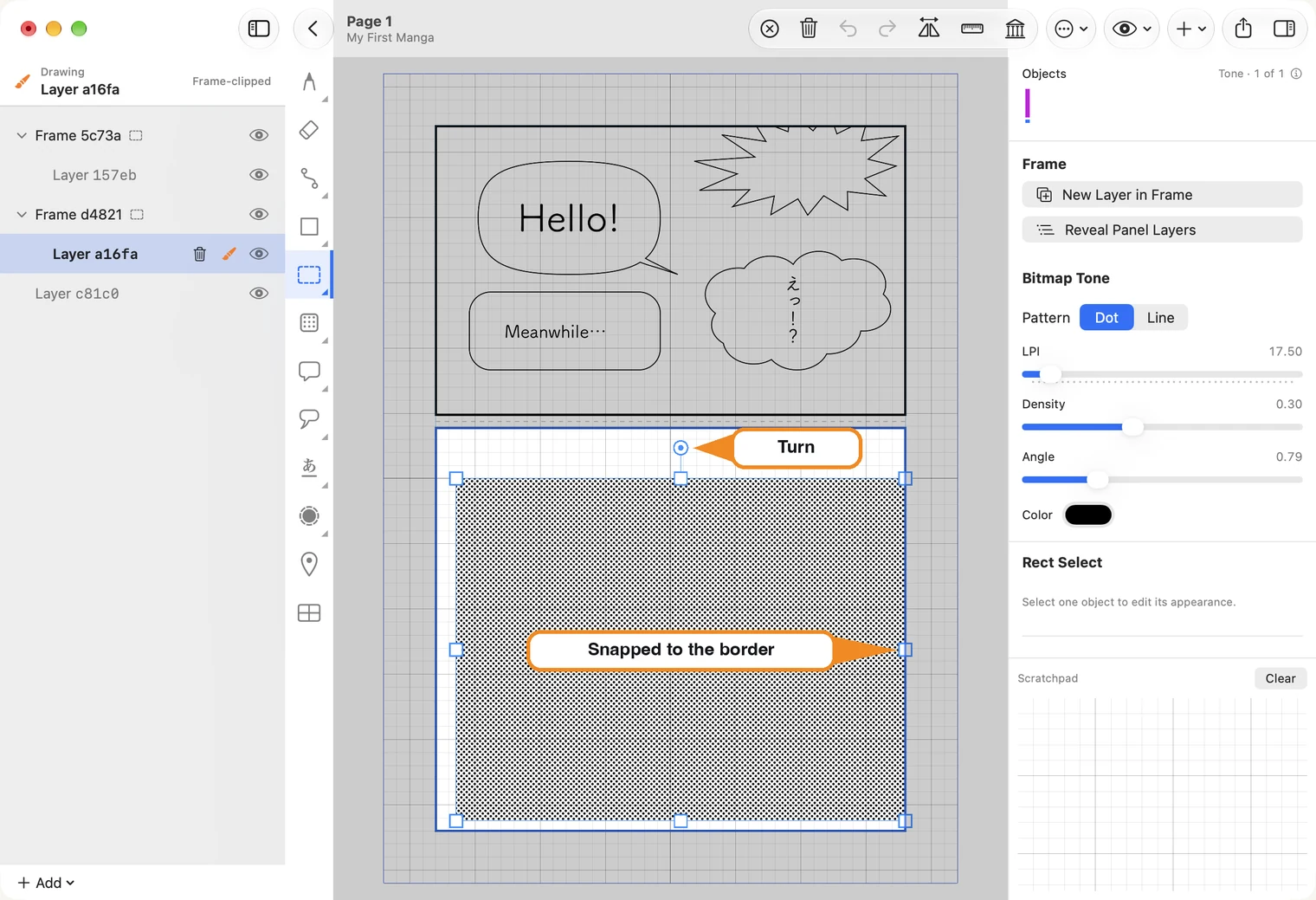
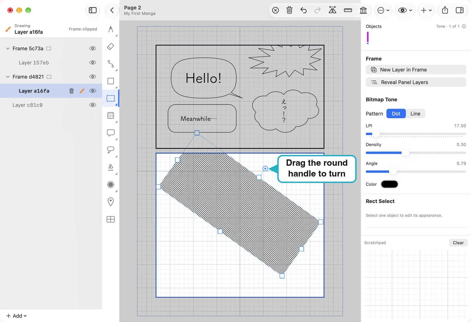
The round handle above the tone turns it. Only the shape turns: the rows of dots keep their own direction, which is the Angle slider on the right.
Aim a burst or a gradient
Concentration Lines burst toward a centre. Lay the tone, then drag the small green square: the lines follow it.
Keep the centre inside the tone, and not too far to one side: the lines have a fixed reach (Outer R), and if the centre goes too far a corner of the tone is left bare.
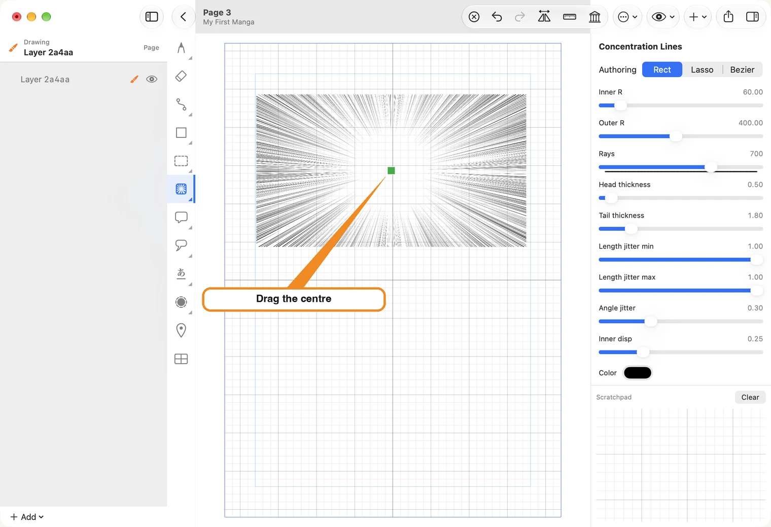
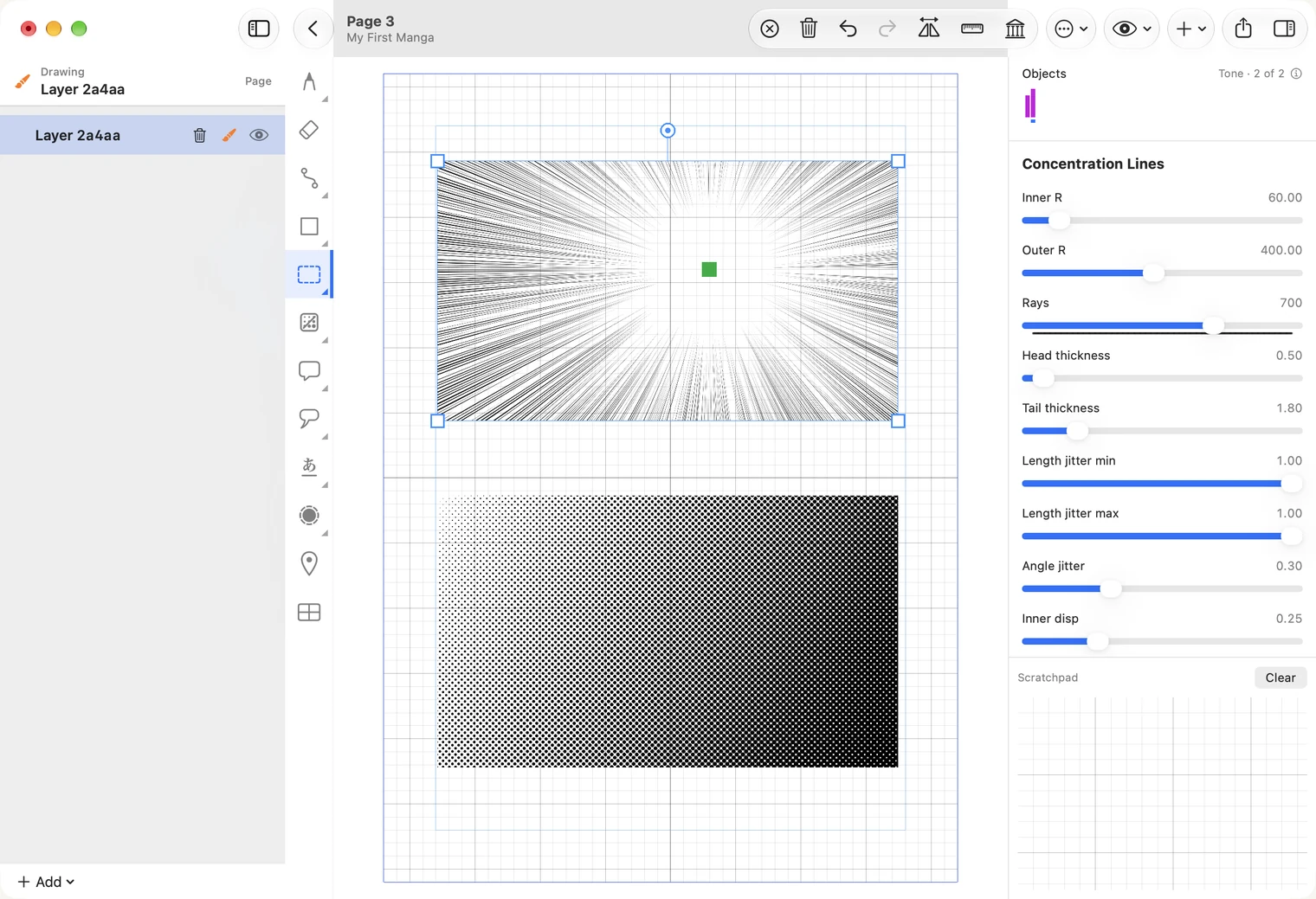
On the right, Rays is how many lines there are, and Inner R is the size of the clear space in the middle.
A Dot Gradient fades from one end to the other. It has two squares: blue at the light end, red at the dark end. Drag either to change the direction and length of the fade.
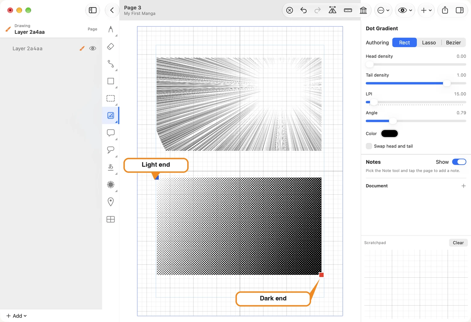
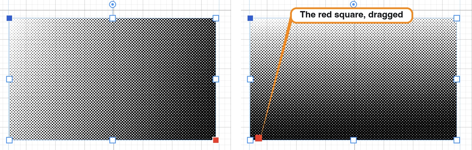
Head density and Tail density set how light and how dark the two ends are; Swap head and tail turns the fade around. LPI is the size of the dots: the picture uses a low value, 15, so the dots are easy to see; a printed page usually uses a much finer one.
Speed lines, rope hatching, script tones
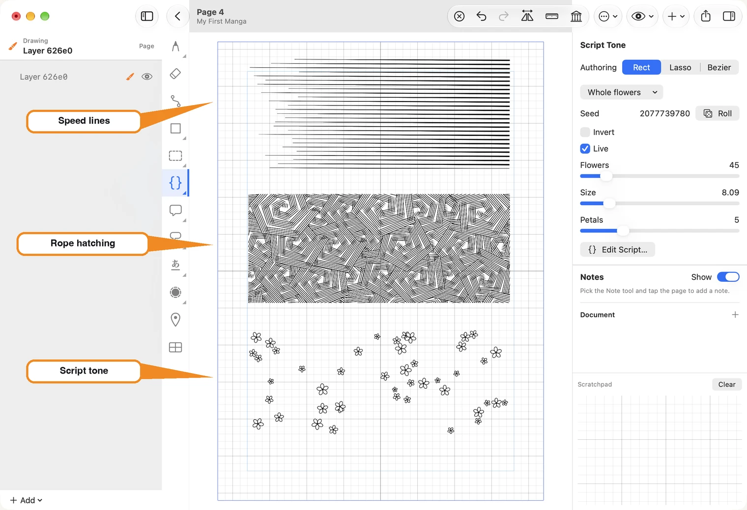
- Speed Lines streak from a blue square to a red one, thin at the start and thick at the end. Drag the red square and the lines turn to follow it. Spacing sets how close they are.
- Rope Hatching fills the area with crossed bundles of lines. Re-roll pattern draws a different arrangement.
- Script Tone scatters a pattern. Choose which from the list at the top of its settings.
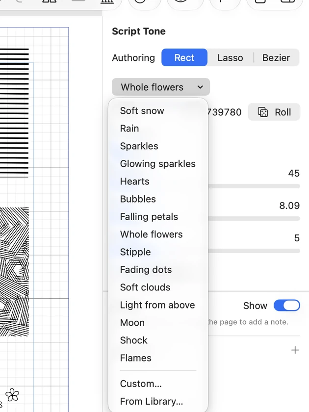
Each pattern has its own sliders: for flowers, how many, how big, and how many petals. Roll scatters them differently.
Custom… and From Library… at the bottom of the list are for patterns you write yourself as a small script. You can leave them alone until you want a pattern the list does not have.
Fix an edge
A tone does not have to stay a box. The edge tool, below the text tool in the strip, moves a tone's edge without redrawing it.
- Choose the edge tool and click the tone, so it is selected.
- Press on the edge and drag. The part of the edge under the brush moves with you, and the edge on either side follows smoothly.
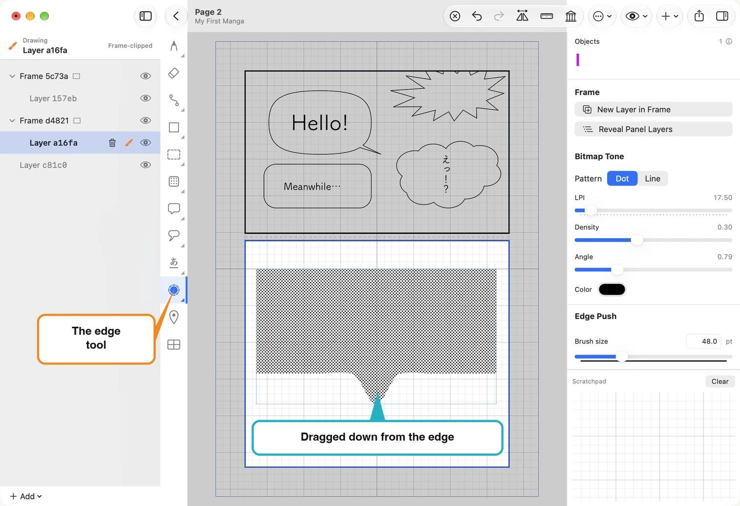
This is how a shadow is fitted to a face: lay the tone roughly, then push its edge to where the shadow should end. The same works against any drawn line.
Brush size on the right sets how much of the edge moves at once. Zoom in before you push: a small gap is easier to close when it is large on screen.
Right-click the edge tool for its second kind, Edge Smooth. Push moves an edge to where you want it; Smooth leaves it where it is and takes the wobble out. Sweep along the edge, and again if it needs it.
Smoothing on the right sets how far the edge may move from what you drew: higher gives a calmer curve.
Reshape a tone point by point
A tone's outline is a path, so the path tools work on it. Right-click the path tool and choose Path Edit (or select the tone and press Edit Path on the right). Click the tone's edge, not its middle: the outline shows a square at each corner.
- Drag a square to move that corner.
- Click the edge between two squares to add a point there, then drag it.
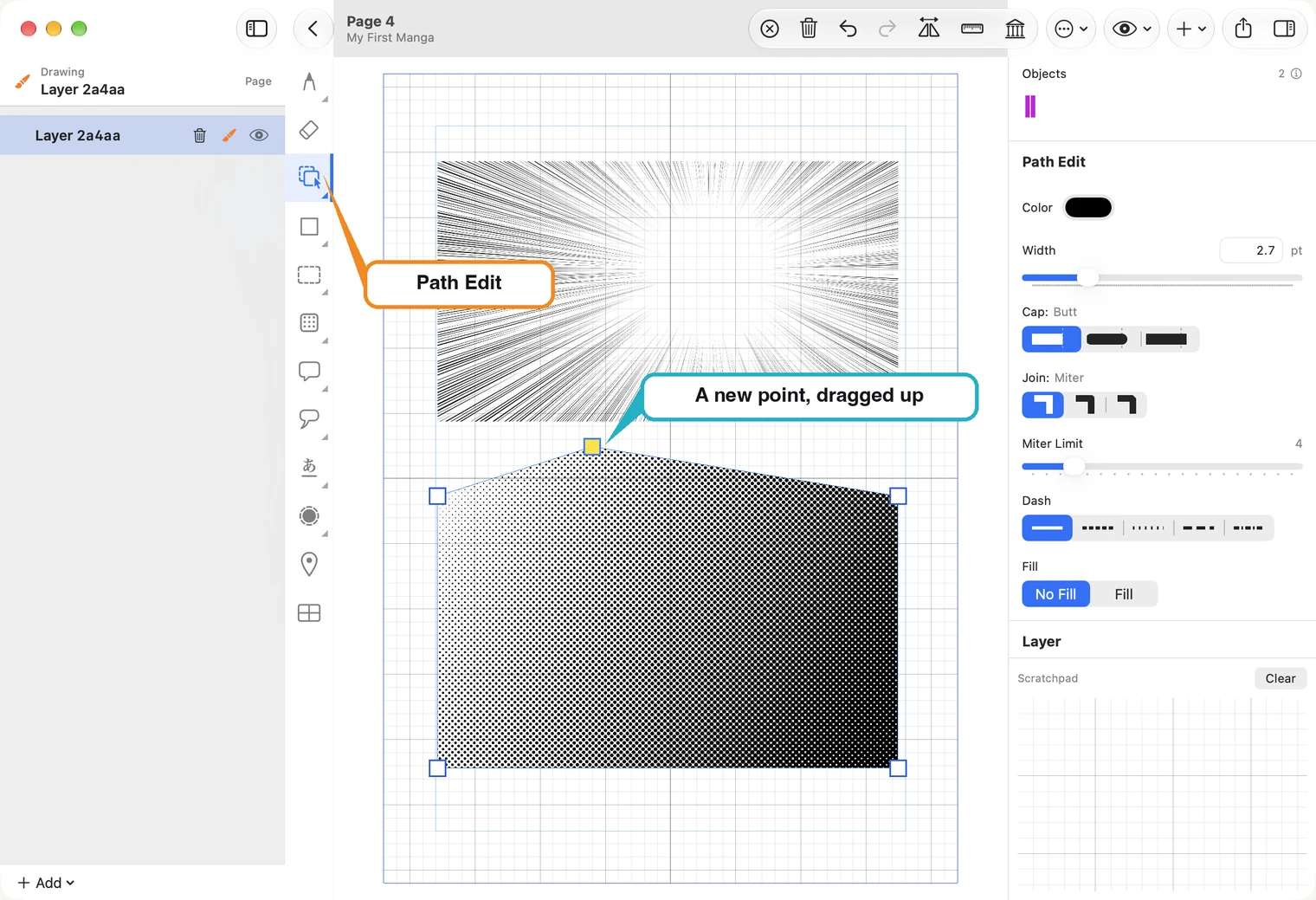
The edge tool is quicker for a soft, freehand fit; Path Edit is for exact corners and straight sides. More about points in Paths and shapes.